
We pass data from a parent component to a child component via props. But passing props can become very inconvenient if you have to pass them through multiple components. or if many components in your app need the same information. To solve this, we can use the useContext hook, which helps in letting the parent component make some information available to any component in the tree below that is wrapped in the parent component.

How to create context?
Step 1: Create the ThemeContext.
First, we need to create a context that will hold our theme data.
File Name: themeContext.tsx
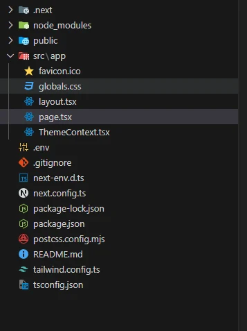
  "use client";

  import { createContext, useState, useEffect, ReactNode, useContext } from "react";

  // Define the context type
  interface ThemeContextType {
    theme: "light" | "dark";
    toggleTheme: () => void;
  }

  const ThemeContext = createContext<ThemeContextType | null>(null);

  export const ThemeProvider = ({ children }: { children: ReactNode }) => {
    const [theme, setTheme] = useState<"light" | "dark">(() => {
      // Retrieve theme from localStorage or default to light mode
      if (typeof window !== "undefined") {
        return (localStorage.getItem("theme") as "light" | "dark") || "light";
      }
      return "light";
    });

    useEffect(() => {
      if (typeof window !== "undefined") {
        document.documentElement.setAttribute("data-theme", theme);
        localStorage.setItem("theme", theme);
      }
    }, [theme]);

    const toggleTheme = () => {
      setTheme((prevTheme) => (prevTheme === "light" ? "dark" : "light"));
    };

    return (
      <ThemeContext.Provider value={{ theme, toggleTheme }}>
        {children}
      </ThemeContext.Provider>
    );
  };

  export const useTheme = (): ThemeContextType => {
    const context = useContext(ThemeContext);
    if (!context) {
      throw new Error("useTheme must be used within a ThemeProvider");
    }
    return context;
  };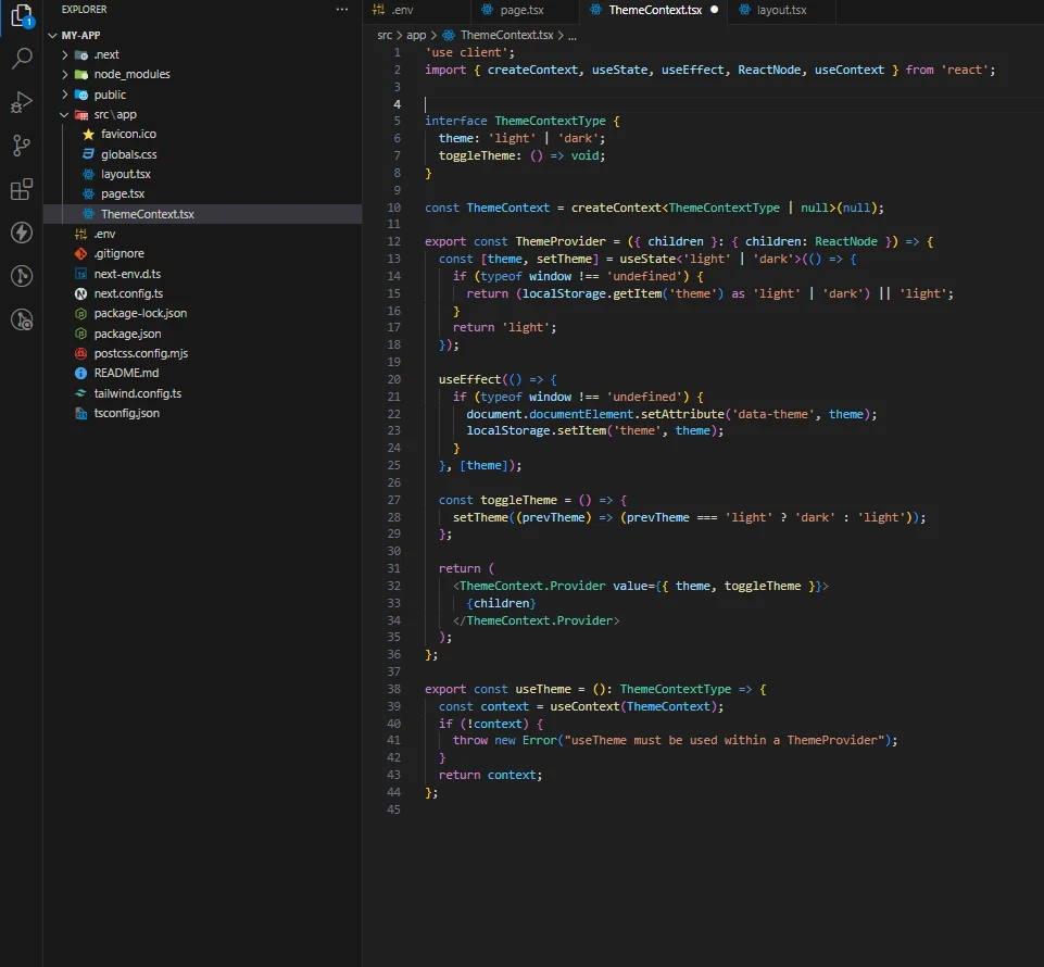
In this code, we create a ThemeContext using createContext() and a ThemeProvider component that holds the theme state and a function to toggle between light and dark modes. We have to wrap the whole code inside the theme provider to use the context.
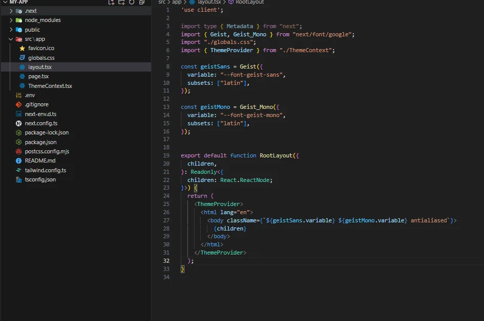
Step 2: Update layout.tsx
Wrap layout.tsx with ThemeProvider, which we created above.
  "use client";

  import { Geist, Geist_Mono } from "next/font/google";
  import "./globals.css";
  import { ThemeProvider } from "./ThemeContext";

  const geistSans = Geist({
    variable: "--font-geist-sans",
    subsets: ["latin"],
  });

  const geistMono = Geist_Mono({
    variable: "--font-geist-mono",
    subsets: ["latin"],
  });

  export default function RootLayout({
    children,
  }: Readonly<{
    children: React.ReactNode;
  }>) {
    return (
      <ThemeProvider>
      <html lang="en">
        <body className={` ${geistSans.variable} ${geistMono.variable} antialiased `}>
          {children}
        </body>
      </html>
    );
  }
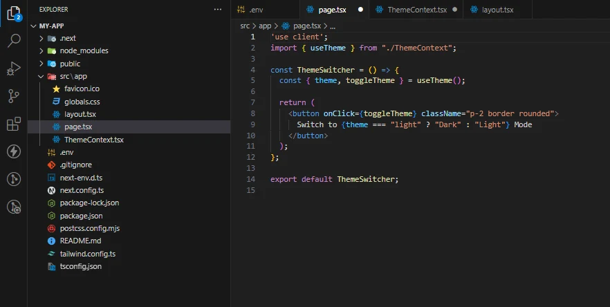
Step 3: Consuming the Context: You can create a new page and paste this code.
File Name: page.tsx
Next, we use the useContext hook to use the theme data in any component that needs it.
"use client";
import { useTheme } from "./ThemeContext";

const ThemeSwitcher = () => {
  const { theme, toggleTheme } = useTheme();

  return (
    <button onClick={toggleTheme} className="p-2 border rounded">
    Switch to {theme === "light" ? "Dark" : "Light"} Mode
  </button>
  );
};

export default ThemeSwitcher;
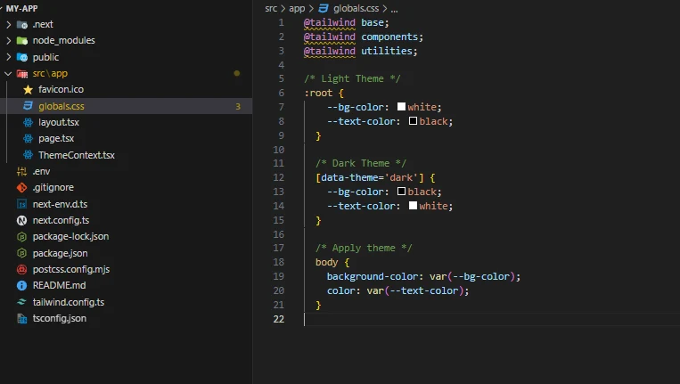
Add global CSS colors for theme switching.
step 4: - global.css
  /* Light Theme */

:root {
  --bg-color: white;
  --text-color: black;
}

/* Dark Theme */

[data-theme="dark"] {
  --bg-color: black;
  --text-color: white;
}

/* Apply theme */

body {
  background-color: var(--bg-color);
  color: var(--text-color);
}
In this ThemedComponent, the useContext hook allows us to access the current theme and toggle function directly. This component will render differently based on the theme and provide a button to switch themes.
In this example, ThemedComponent behaves similarly to the web, and based on color, we can handle the theme color accordingly.
