Most of the designers use the table , float , and position property to create a column layout. Sometimes it creates the problem as when we use float property, our parent element doesn't cover properly to the child elements according to the height. And we will need to use overflow: hidden; property to fix this problem, even though this is not a proper solution because sometimes we don't want to use overflow property and all of the other hacks like clearfix .
We get the solution to all those problems with flex property. Firstly, we define the display: flex; to a container. After that, we create elements inside this flex container. Normally we call flex items to the inside elements of the flex container. We can manage the direction, spacing and aligning to the flex items with reference to the flex container.
Let’s get a visual from below code:
 <style>
 .flex-container{
   border: 2px solid red;
   padding: 15px;
   display: flex;
 }
 .flex-items{
   width: 156px;
   height: 100px;
   background: skyblue;
   color: #600;
   text-align: center;
   border: 1px solid #600;
 }
 </style>
 <div class="flex-container">
   <div class="flex-item">Flex Item 1</div>
   <div class="flex-item">Flex Item 2</div>
   <div class="flex-item">Flex Item 3</div>
 </div>
Output:

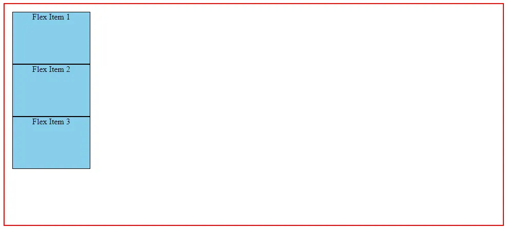
You have seen in the above screenshot, we created three boxes (flex items) inside one div (flex container). Now we manage these three boxes as a column of a row. Here we can call a row to our main flex container.
Okay, now we talk about responsive behavior of our columns.
If we need to push all of the columns to the right side we need to define justify-content: flex-end; to our main flex container. Let’s see in below screenshot:
 .flex-container{
   border: 2px solid red;
   padding: 15px;
   display: flex;
   justify-content: flex-end;
 }

If you want all columns to the center of flex container you need to define justify-content: center; If you want to back column to the left side you need to define justify-content: flex-end;
 .flex-container{
   border: 2px solid red;
   padding: 15px;
   display: flex;
   justify-content: center;
 }

If you want the same size of gutters between columns and also left and right to main flex container, you can use mentioned below these three properties according to your layout.
- justify-content: space-around;
- justify-content: space-evenly;
- justify-content: space-between;
You can see the output in the below screenshot of these properties:
Output of justify-content: space-around;

Output of justify-content: space-between;

Output of justify-content: space-evenly;

In the above example, we align column horizontally with the main flex container. If we want to align vertically, we need to use the align-items property.
Firstly, we define some height to our main flex-container to see the effect of align-items property because till now, we have used flex container as an auto height.
 .flex-container{
   border: 2px solid red;
   padding: 15px;
   display: flex;
   height: 140px;
   justify-content: space-between;
 }
Output:

Okay, now we centered vertically our columns with the main container.
Let’s see in the below screenshot:
 .flex-container{
   border: 2px solid red;
   padding: 15px;
   display: flex;
   height: 140px;
   justify-content: space-between;
   align-items: center;
 }

And you can use the same value to align columns vertically like flex-end, flex-start, space-around, space-between, and space-evenly.
Now we stack columns top to bottom for responsive layout of small devices. Because, by default, flex property allows to column stack as a row direction left to right, but when we open a web layout in mobile devices, we need to stack columns top to bottom for perfect view. For doing this we need to define a property of flex container. This property name is flex-direction.
Here we have four value of stack flex items direction:
- flex-direction: row;
- flex-direction: row-reverse;
- flex-direction: column;
- flex-direction: column-reverse;
Flex layout by default render flex items as a row direction, If you want to reverse your items you need to use flex-direction: row-reverse; If you want your flex items in top to bottom direction you need to define flex-direction: column; property to our flex-container.
Let's look at an example with the help of below screenshot:
 .flex-container{
   border: 2px solid red;
   padding: 15px;
   display: flex;
   height: 400px;
   flex-direction: column;
 }

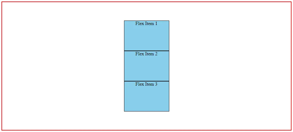
Above an example of stack flex items as top to bottom direction. If you want align flex-items horizontally you need to define property align-items: center; and for aligning vertically define justify-content: center;
See in the below screenshot:
.flex-container{ border: 2px solid red; padding: 15px; display: flex; height: 400px; flex-direction: column; justify-content: center; align-items: center; } 
I believe we have covered up the basics of creating responsive layout using some flexbox properties. But now, has been left a lot of things for creating more complex layout using Flexbox. Which we will cover in the upcoming article.
